The Anatomy of a Bestselling Fiction Book Cover
Introduction
Have you ever wondered why some books instantly grab your attention while others fade into the background? The secret lies in the anatomy of the book cover. A bestselling fiction cover is not just a pretty picture; it is a carefully constructed marketing tool designed to trigger specific psychological responses in the target audience.
In this deep dive, I will dissect the anatomy of a bestselling fiction book cover, exploring the critical elements that professional designers use to communicate genre, tone, and quality.

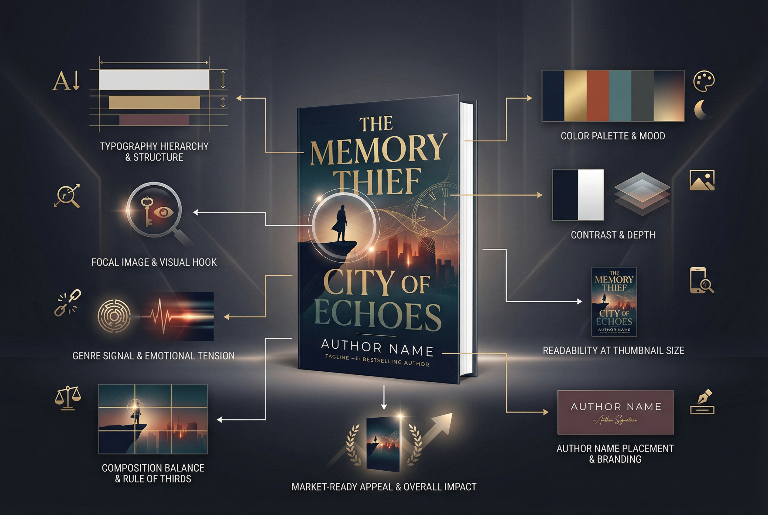
1. Genre Signifiers: The Silent Language
The primary job of a book cover is to tell the reader what kind of book they are looking at without them having to read a single word. These are called "genre signifiers."
- Thrillers & Suspense: Often use bold, sans-serif typography, high-contrast lighting, cool color palettes (blues, blacks, stark whites), and silhouettes or blurred figures to convey mystery and danger.
- Romance: Utilizes warm color palettes (pinks, reds, purples), script or elegant serif fonts, and imagery that focuses on connection (couples, intertwined hands, or illustrated character portraits for the popular "rom-com" style).
- Fantasy: Features intricate, custom typography, magical elements (glowing lights, mythical creatures), and sweeping landscapes or detailed symbolic objects (swords, crowns).
If your cover fails to include the correct genre signifiers, you will attract the wrong readers (who will leave bad reviews) and miss your target audience entirely.

2. Typographic Hierarchy
Typography is often the difference between an amateur cover and a professional one. Bestselling covers employ a strict typographic hierarchy to guide the reader's eye.
- The Title: This is usually the most prominent element. It should be readable even at thumbnail size. The font choice must reflect the genre.
- The Author Name: For established authors, the name might be as large (or larger) than the title. For debut authors, it is usually smaller but still clearly legible, often placed at the top or bottom of the cover.
- The Subtitle or Tagline: A short, punchy hook that gives a hint about the plot. This is usually in a clean, simple font that doesn't compete with the main title.
- Endorsements (Blurbs): A quote from a famous author or publication. This provides instant social proof but must be placed carefully so it doesn't clutter the design.
3. Color Theory and Contrast
Color is a powerful emotional trigger. Professional designers use color theory to evoke the mood of the story.
- Complementary Colors: Using colors opposite each other on the color wheel (like blue and orange) creates high contrast and visual excitement, making the cover pop off the screen.
- Monochromatic Schemes: Using variations of a single color can create a moody, atmospheric feel, often used in literary fiction or dark thrillers.
- Contrast: High contrast between the text and the background is non-negotiable. If the title blends into the background imagery, the cover fails its primary purpose.

4. Composition and Focal Points
A bestselling cover has a clear focal point—one central element that draws the eye. This could be a character's face, a symbolic object, or even the typography itself.
The composition should follow the "Rule of Thirds" or the "Golden Ratio" to create a balanced, aesthetically pleasing layout. The eye should naturally flow from the focal point to the title, and then to the author's name.
5. The Thumbnail Test
In the digital age, your cover will most often be seen as a tiny thumbnail on Amazon or Apple Books. A bestselling cover must pass the "Thumbnail Test."
- Is the title readable when the image is only 100 pixels tall?
- Is the central image or focal point still clear?
- Does the color palette still stand out against the white background of the retailer's website?
If a design looks great in high resolution but turns into a muddy, illegible mess when shrunk down, it will not sell books.
Conclusion
Creating a bestselling fiction book cover requires a deep understanding of market trends, psychology, and design principles. It is an investment in your book's success.
At Billy Design Studio, I don't just design covers; I engineer them to sell. I analyze your genre, study the current bestsellers, and craft a visual identity that demands attention.

Contact me today to discuss your next fiction project.
Ready to elevate your book?
Apply these strategies to your next release with professional design services from me.
Work With MeRelated Articles

Amazon KDP vs IngramSpark: The Ultimate Guide for Self-Publishers in 2026
Discover the pros, cons, and best strategies for distributing your self-published book across Amazon KDP and IngramSpark to maximize your royalties and reach.
A+ Content Strategies for Self-Published Authors on Amazon
Maximize your book's conversion rate on Amazon with professional A+ Content. Learn what to include, how to design it, and why it matters.